Go.Data dashboards in Tableau
Contact Tracing Monitoring at the University of Texas at Austin with Go.Data & Tableau
Country use case
Background:
The University of Texas at Austin (UT) began using Go.Data in August 2020 in response to the university’s need to track COVID-19 among faculty, staff, and students. A contact tracing program was established in the Dell Medical School to notify contacts of current cases about their exposure status and provide them with resources, including recommendations for isolation and testing. Go.Data was deployed to support this effort.
The UT team created Tableau dashboards connected to the Go.Data API to allow stakeholders (contact tracers, epidemiologists, university leadership) to track contact tracing operations and measure success in real-time.
Implementation
In order to aggregate contact tracing data into a Tableau dashboard, two primary pipelines for data transformation were created.
- One ETL pipeline was created to pull data from the GoData API and format it into an internal SQL database. The team developed a Python package (
pygodata) as a wrapper for common API calls to facilitate data transfer. - The second pipeline aggregated data in the internal SQL server by weekly measurement to prep KPIs of interest.

pygodata
pygodata is a Python package created by the UT team that facilitates API calls to Go.Data. It simply serves as a wrapper to the most frequent API calls they found themselves using. It includes server authentication using the oauth API route, and uses the generated token to make the various GET, PUT, and POST requests required to maintain their contact tracing database.
Data ETL
Data from Go.Data’s mongoDB was replicated into an internal SQL server using pygodata for better downstream manipulability. The included goData_cases_ETL.py script is an example of one of these ETL scripts, where the Go.Data case export is used to transfer data from one resource to another.
Measure Aggregation
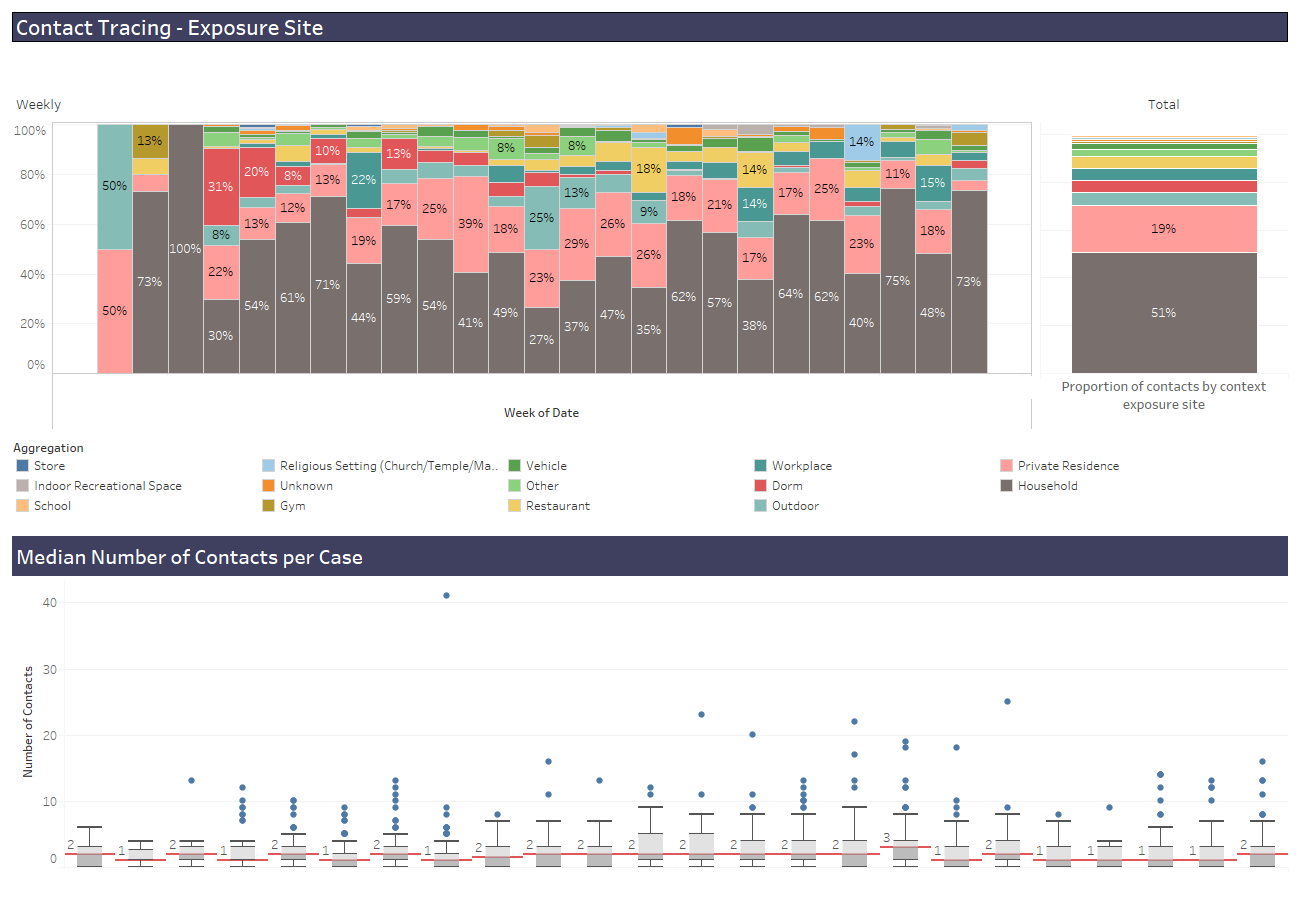
Aggregate measures were compiled into a separate SQL table using a SQL script. The included goData_measures.sql script includes two examples of metrics we were interested in tracking, the proportion of cases that were contacts identified by tracing and the proportion of contacts by context exposure site. Metric collected into this SQL table were directly fed to the live Tableau dashboards.
Tableau Dashboards
Below are some of examples of dashboards used to track contact tracing activities. Some information has been removed for privacy reasons.
Coverage and Impact

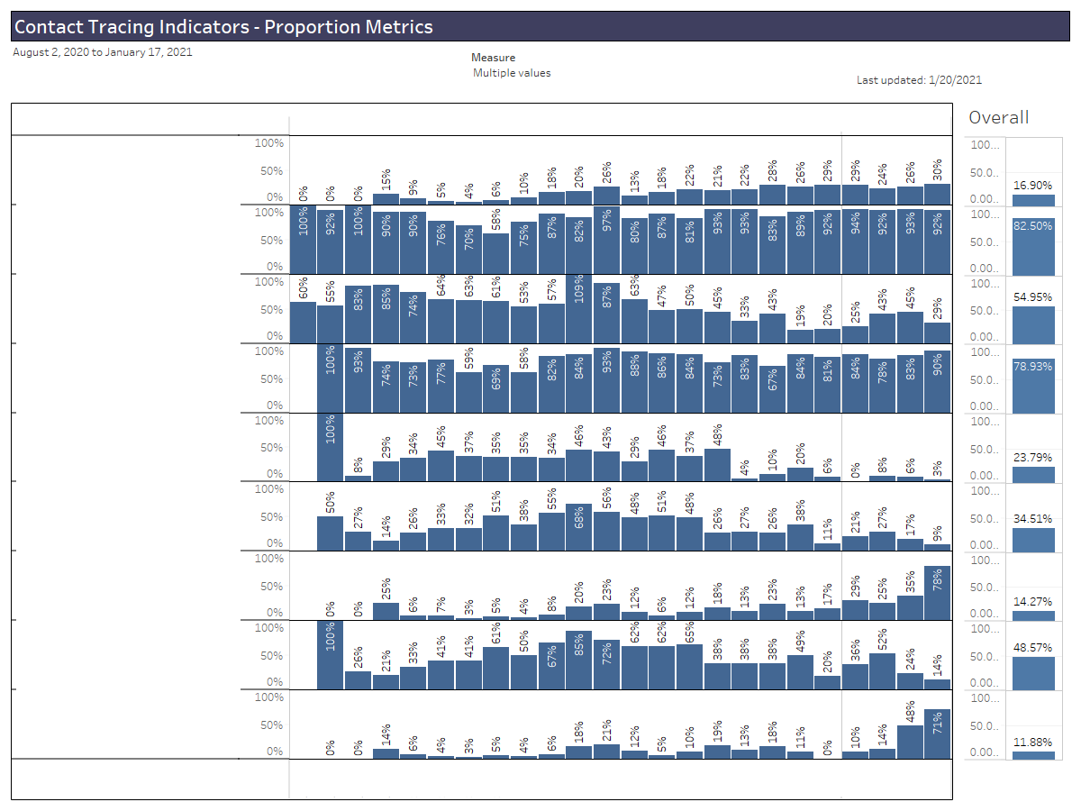
Primary dashboard for assessing contact tracing success, aggregated by week. Metrics include rates of testing among cases and contacts, proportion of new cases that were previously contacts, and proportions of cases and contacts successfully investigated.
Exposures

Dashboard for tracking where case/contact exposures are occurring and numbers of contacts per case, aggregated by week.
Testing and Tracing Timelines

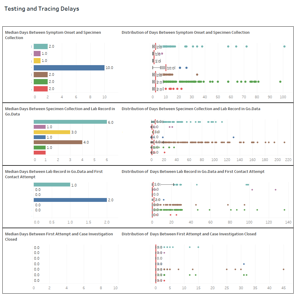
Dashboard for quantifying the timeline of cases and contacts as they are identified, contacted, tested, and closed in our system separated by the organization that sourced the case to contact tracing (redacted).
Case Source

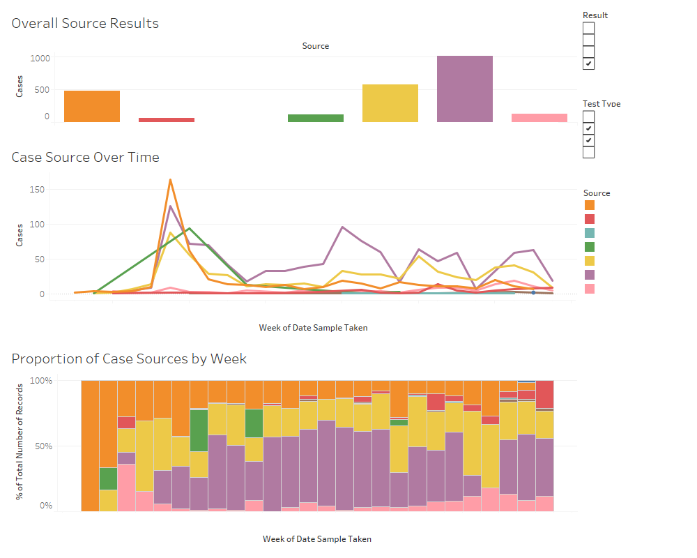
Dashboard examining the number of cases by the reporting authority that referred the case to contact tracing.
To view full resources and scripts, please view the repo here